Types of Charts: An Overview
Understanding the types of charts is essential for effective data visualization. Each chart type serves a unique purpose and is suited for specific types of data. Here are some common types:
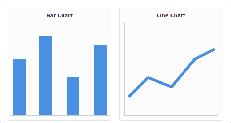
- Bar Charts: Ideal for comparing quantities across categories.
- Line Charts: Useful for showing trends over time.
- Pie Charts: Best for illustrating proportional relationships, but use sparingly to avoid misinterpretation.
- Scatter Plots: Excellent for revealing correlations between two variables.
When selecting a chart type, consider your audience and the message you want to convey. Avoid cluttering charts with unnecessary elements, as this can obscure the data’s insights.
Understanding Your Data

Understanding your data is pivotal for effective analysis. Begin by familiarizing yourself with the data types, such as quantitative and qualitative, as these influence your analytical approach. Next, conduct a data audit to identify:
- Missing values that may skew your findings.
- Outliers that require special attention.
- The distribution of your data to determine the appropriate statistical tests.
Utilize visualization tools like histograms or scatter plots to recognize trends and patterns. Remember, common pitfalls include overlooking data cleaning and making assumptions without proper analysis. By maintaining a systematic approach to understanding your data, you enhance the reliability of your insights.
Common Mistakes in Chart Selection

When selecting charts for data presentation, data analysts often encounter several common mistakes that can undermine their analysis.
First, using inappropriate chart types can misrepresent data relationships. For example, a pie chart should only be used when showing parts of a whole, while a line chart is ideal for trends over time.
Additionally, be cautious of these pitfalls:
- Overcomplicating visuals: Avoid cluttering charts with excessive colors or labels.
- Ignoring data scale: Ensure that axes are appropriately scaled to avoid misleading interpretations.
- Neglecting audience context: Tailor visuals to the knowledge level of the audience.
By keeping these considerations in mind, analysts can enhance the clarity and impact of their data visualizations.
Common Chart Types and Their Uses

Understanding common chart types is essential for effective data visualization. Each chart type serves specific purposes:
- Bar charts: Ideal for comparing discrete categories.
- Line charts: Best for showcasing trends over time.
- Pie charts: Useful for displaying proportions, but avoid them for complex data.
- Scatter plots: Great for illustrating relationships between two continuous variables.
When selecting a chart type, consider your audience. Ensure simplicity and clarity; complex visuals can lead to confusion. Additionally, pay attention to scaling and axis labeling to avoid misinterpretation. Always choose the chart that best communicates your data’s story.
Avoiding Common Charting Mistakes

Effective data visualization is crucial for insightful analysis. To enhance your charting skills, be mindful of these common pitfalls:
- Overloading Information: Avoid cluttering your charts with excessive data points that obscure key messages.
- Poor Color Choices: Use color palettes that are accessible to those with color vision deficiencies, ensuring clarity.
- Inconsistent Scales: Keep axes consistent to avoid misleading interpretations.
Additionally, always label your axes clearly, and provide legends if using multiple data series.
Finally, consider your audience’s familiarity with the data—simplifying complex visuals can foster better understanding and engagement.
Step-by-Step Chart Selection Guide

When selecting a chart type, it’s essential to follow a step-by-step approach to ensure clarity and effectiveness in data presentation. Consider these key factors:
- Data Type: Identify whether your data is categorical, continuous, or temporal.
- Comparison: Determine if you want to compare values across categories, trends over time, or part-to-whole relationships.
- Audience: Tailor your chart choice to your audience’s familiarity with data visualizations.
Common pitfalls include:
- Using the wrong chart for data type, such as employing a pie chart for complex differences.
- Overloading a chart with too much information, which can obscure the key message.
By following these guidelines, you can enhance the clarity and impact of your data visualizations.
Tools for Effective Data Visualization
Effective data visualization is crucial for communicating insights clearly and engagingly. To achieve this, data analysts should utilize a range of powerful tools:
- Tableau: Great for creating interactive dashboards.
- Power BI: Integrates seamlessly with Microsoft products.
- Python libraries (e.g., Matplotlib, Seaborn): Perfect for custom visualizations.
Common pitfalls to avoid include cluttering visuals with too much information and failing to tailor designs for your audience. Always ensure that visualizations adhere to best practices such as maintaining clear labels, choosing appropriate color schemes, and using the right type of chart for your data. These strategies foster better understanding and retention of information among stakeholders.
Practical Steps to Selecting the Right Chart

To effectively select the right chart, follow these practical steps to ensure your data is communicated clearly.
Identify the nature of your data: Determine whether it is categorical, numerical, or time-series.
Choose the chart type based on relationships:
- Bar charts for comparing categories.
- Line charts for trends over time.
- Pie charts for showing parts of a whole, but use sparingly.
Avoid common pitfalls:
– Don’t overload a chart with too much information.
– Ensure labels are clear for accurate interpretation.
Finally, test your chart with peers to gauge its effectiveness before finalizing. This approach promotes better understanding and insights from your data analysis.
FAQ:
Use bars for categorical comparisons; keep categories sorted and labeled.
Use a line chart with clear intervals and a labeled timeframe; add a reference line for targets if needed.
Avoid pies for precise comparisons of many categories; use bars or a table instead.
Use histograms, box plots, or density charts depending on audience familiarity and precision needs.
Use scatter plots; consider adding trend lines or small multiples for groups.